Creating change for Avanade
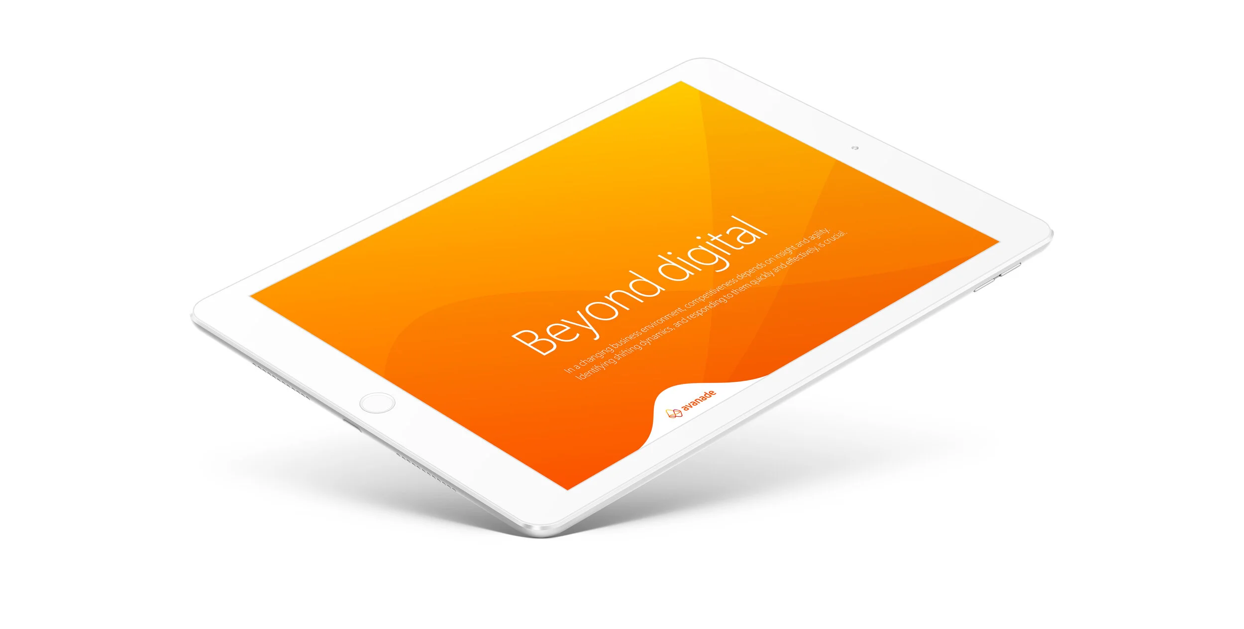
Avanade’s vision is to be the leading digital innovator, realising results for clients and their customers through the power of people and the Microsoft ecosystem. In 2016 I embarked on a series of one and two week ‘labs’, working closely with the client to review their brand. As a result, a new brand personality was developed as well as a visual identity that has transformation at its heart.
Over the course of my eight years at The Team I worked with Avanade a substantial amount. Initially winning the employee brand with compelling creative ideas based in substantial strategic insight. Eventually, completely rebranding the entire global organisation, creating a technology brand that is both effective and relevant, for clients and customers alike.
By 2016, Avanade had grown to over 30,000 employees globally since the year 2000, but realised that its positioning in the marketplace had fallen behind in its ambitious vision to be the leading digital innovator.
The new Avanade logo represents the ‘dynamic flux’ in the technology sector that exists between inception and solution. The new symbol expresses how they create change, inspire action and realise results, celebrating the bold approach, fresh thinking, passion for tech and infectious optimism of their people.
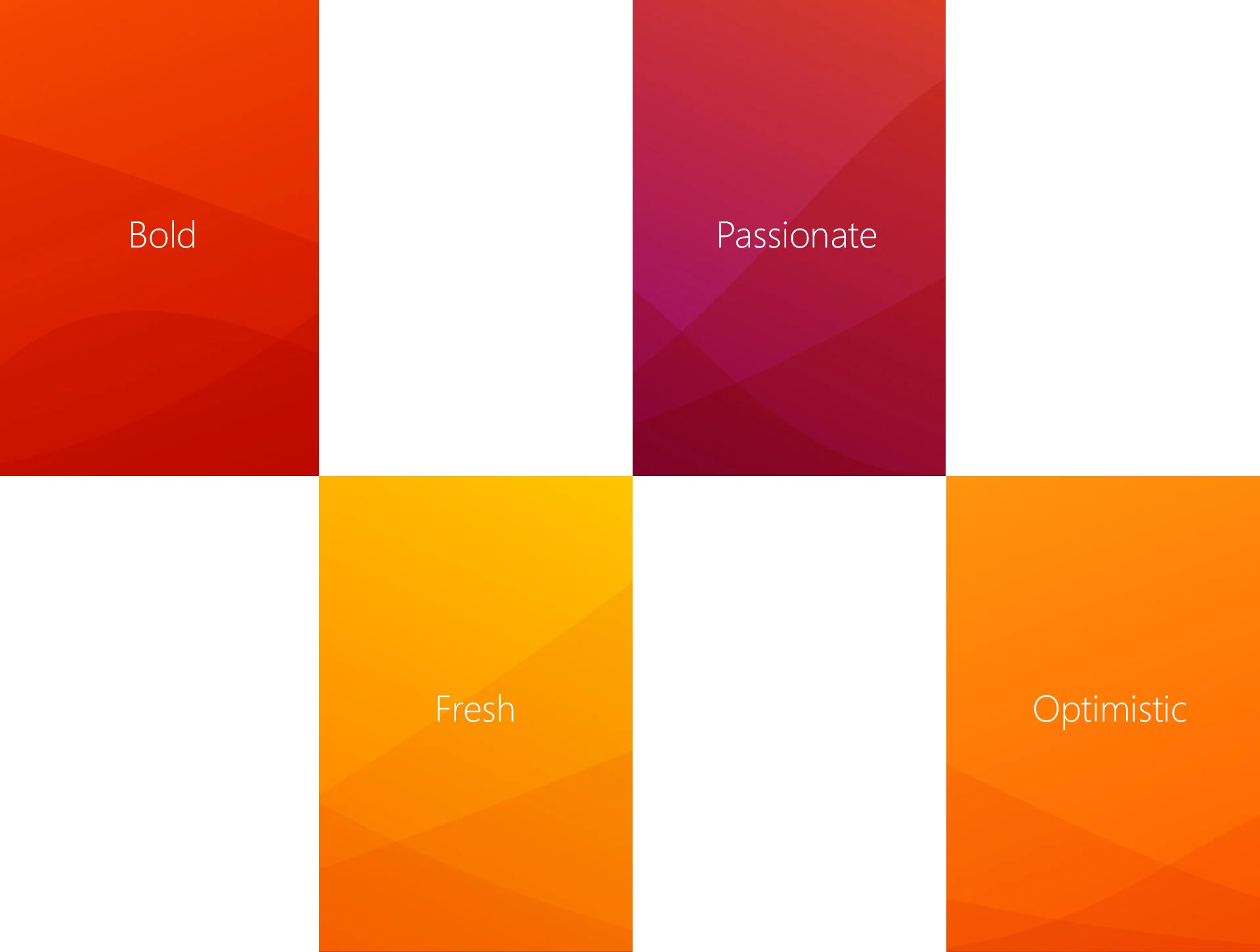
The overall expression of the identity runs with that idea, using waves to express ongoing transformation, and the delivery of that transformation by Avanade into real results and ‘genuine human impact’.
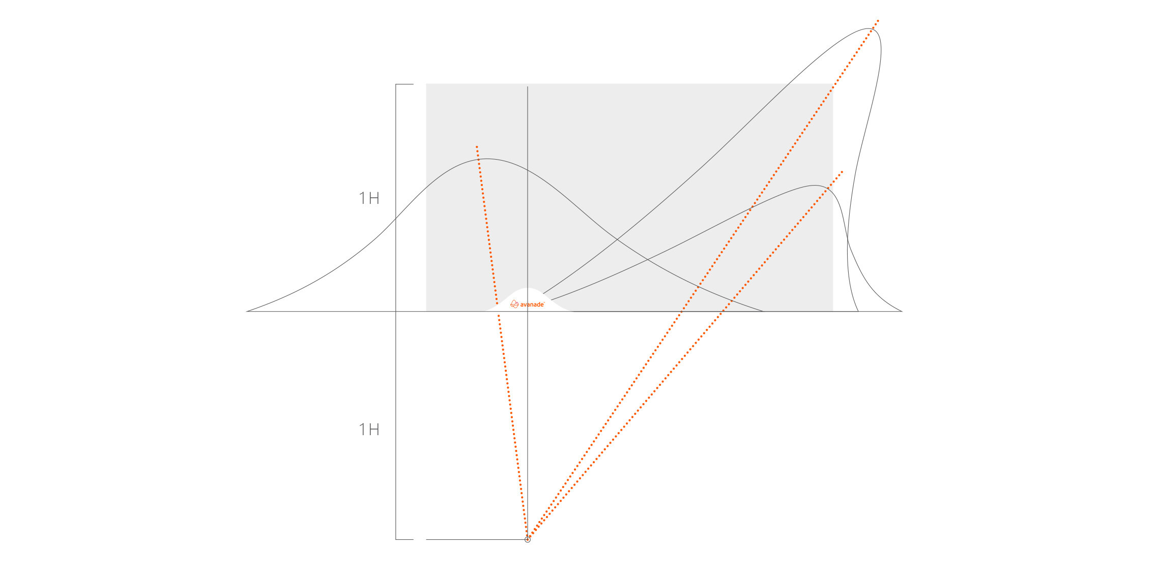
Wave patterns were created to represent the four brand personality traits of being optimistic, fresh, bold and passionate.
The new identity and strategic vision reset the brand. Transforming it into something that their employees were truly proud of, their customers could understand, and what has now become a driving force in the technology sector, once again a relevant part of the conversation.
During my entire time in the industry, I have never seen an organisation embrace something with as much enthusiasm as Avanade employees have done with their new brand.

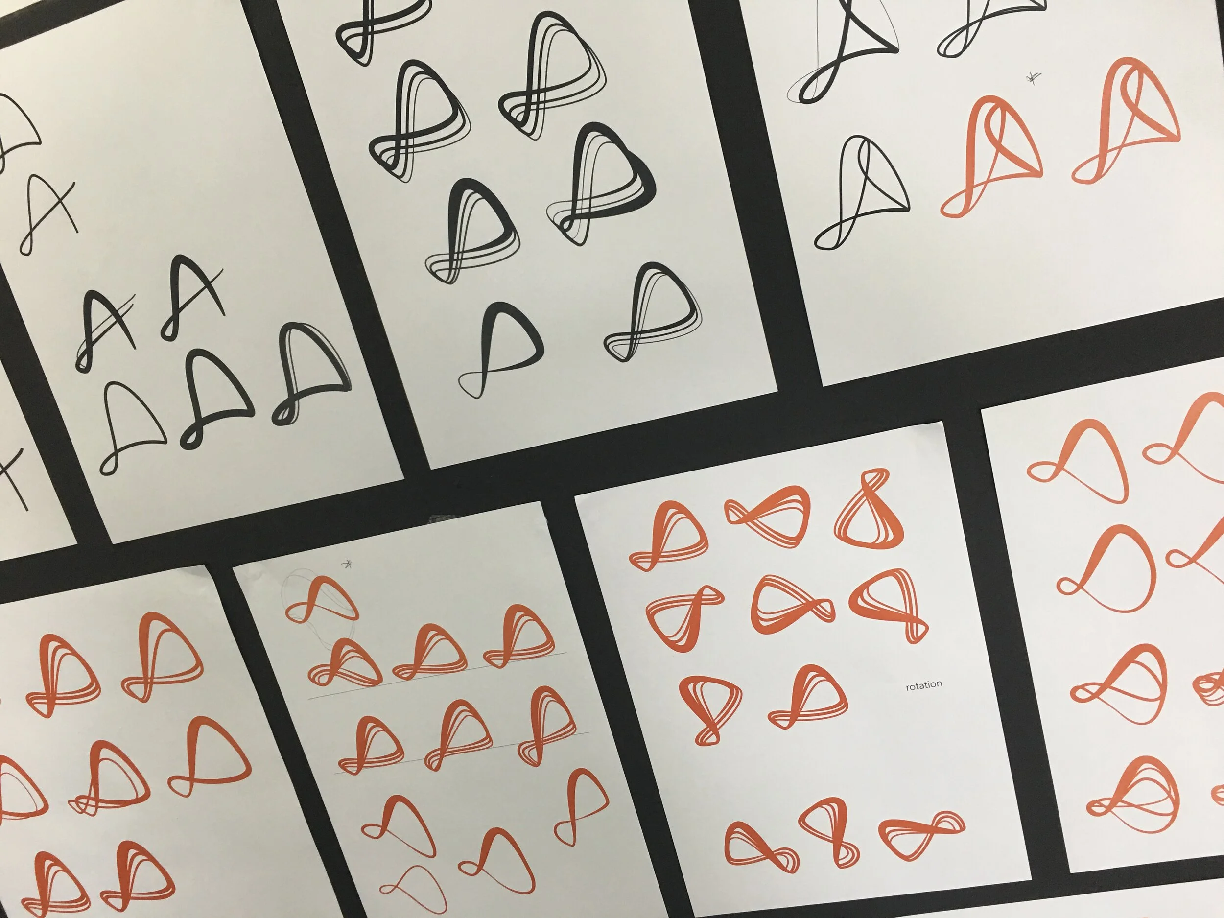
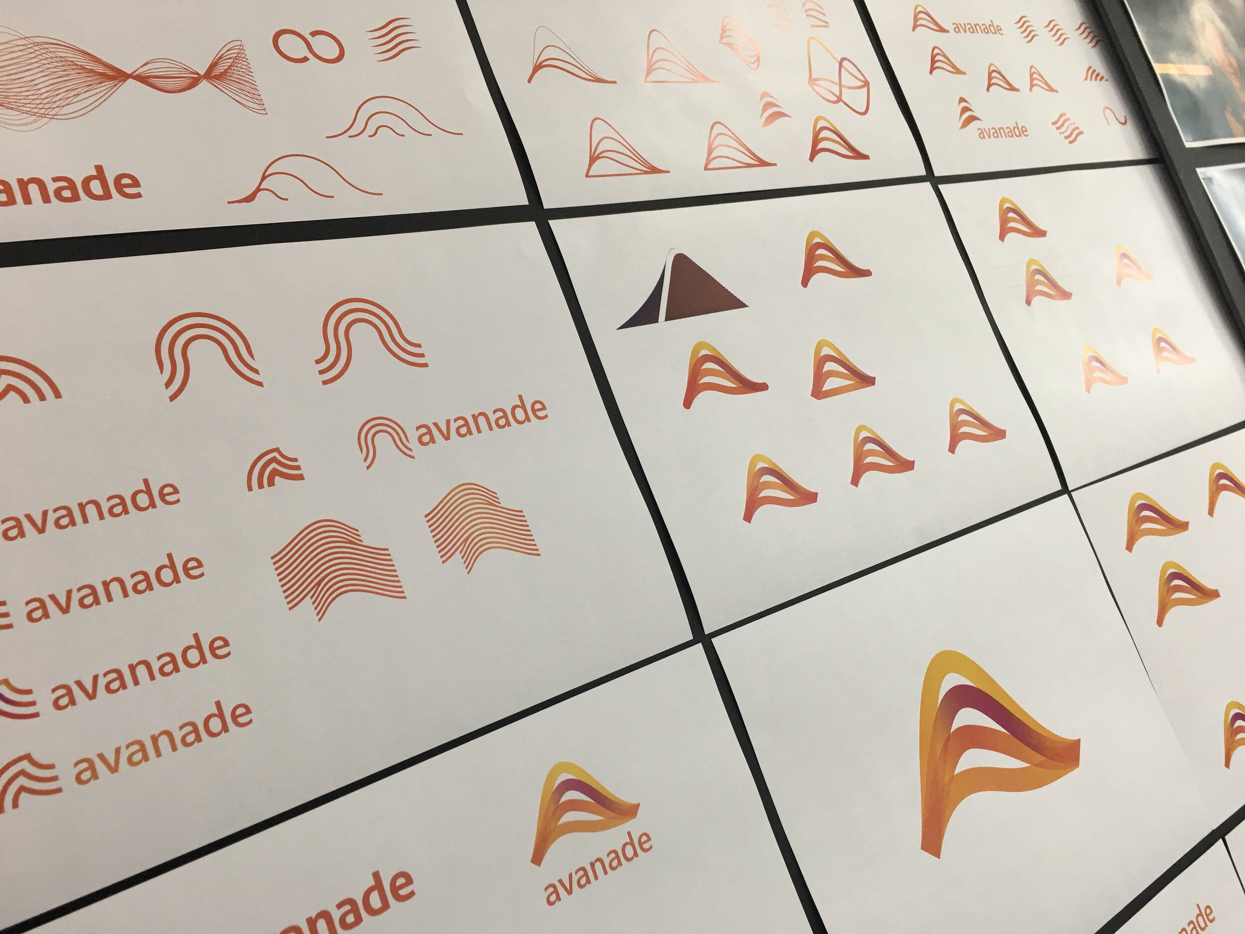

Designing the mark
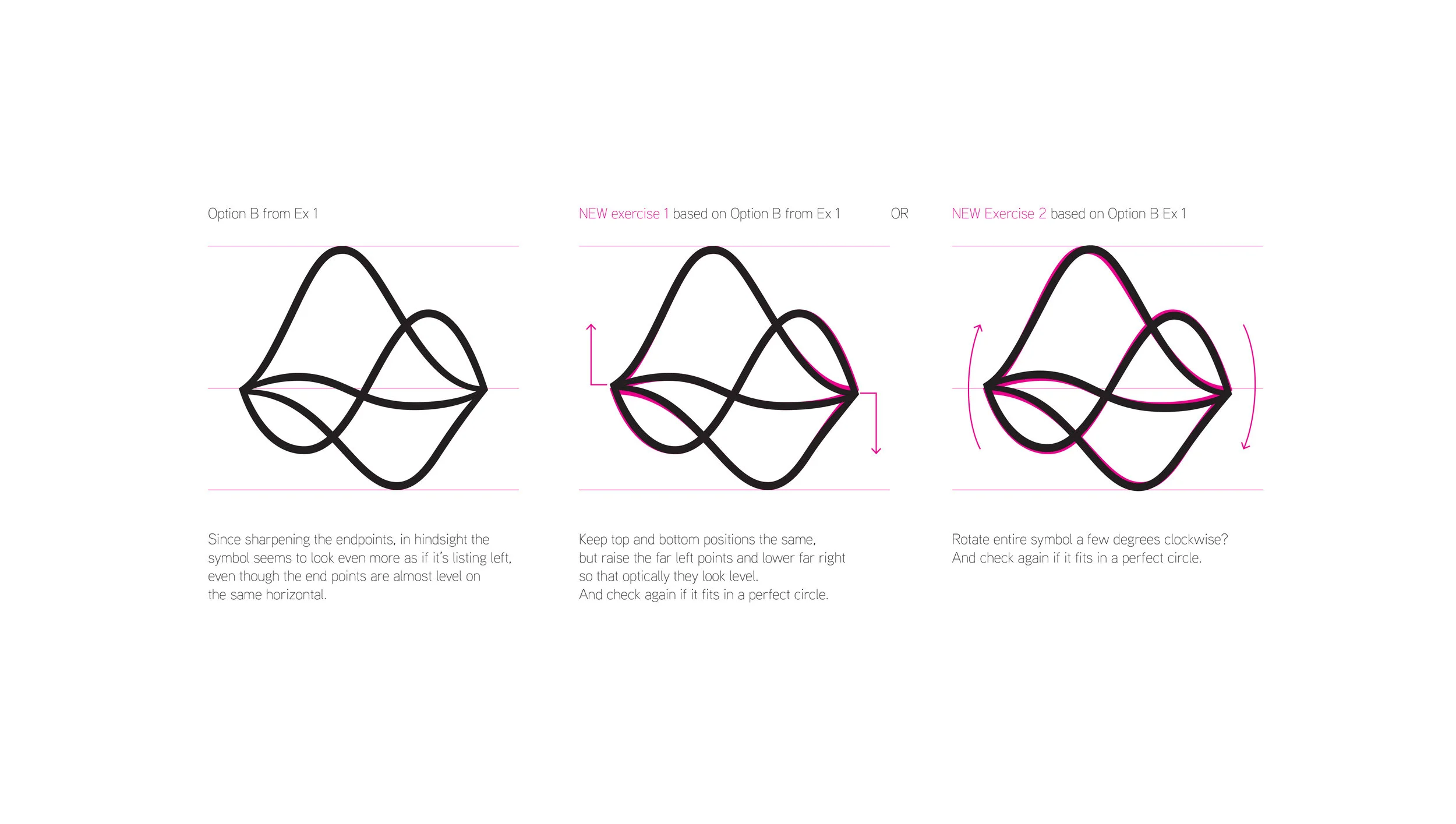
Arrival at a new logo for Avanade came after several workshops, many weeks of exploration and a great deal of collaboration with the client. The logotype and mark were then taken through a final rigorous process of refinement with Dalton Maag. The film above gives some idea of the many territories that were explored along the way, some resulting in there own fledgling version of the overall expression.
Create change
Bringing the brand to life in motion sat at the heart of Avanade’s brand. How the brand expresses itself needed to be about transformation and possibility. Each transition providing surprise and the feeling of insight. This is one example of the many movies I created for Avanade.